Overview
The story of Morgenlevering is about making the morning routine as simple as possible. It is Norway's leading consumer app for fresh breakfast and groceries. The mission was to take a complex logistics process and turn it into a world class mobile experience. I was brought in as the App Designer to rebuild the core experience from the ground up.
Goal
The goal was to build an intuitive consumer app that felt like a morning ritual. We needed to simplify high level problems like family accounts and weekly subscriptions into a friendly interface.
Challenge
The biggest challenge was the data. We had to manage active orders with strict deadlines and multi user billing without overwhelming the customer. I had to balance deep product work with a high velocity development cycle. We needed to look professional to win trust while competing in a fast moving market.
Mobile App
Onboarding & Delivery Selector
The first thing a user does is tell us where they live. I designed a fast address checker and calendar selector to ensure we could get them their food by dawn.
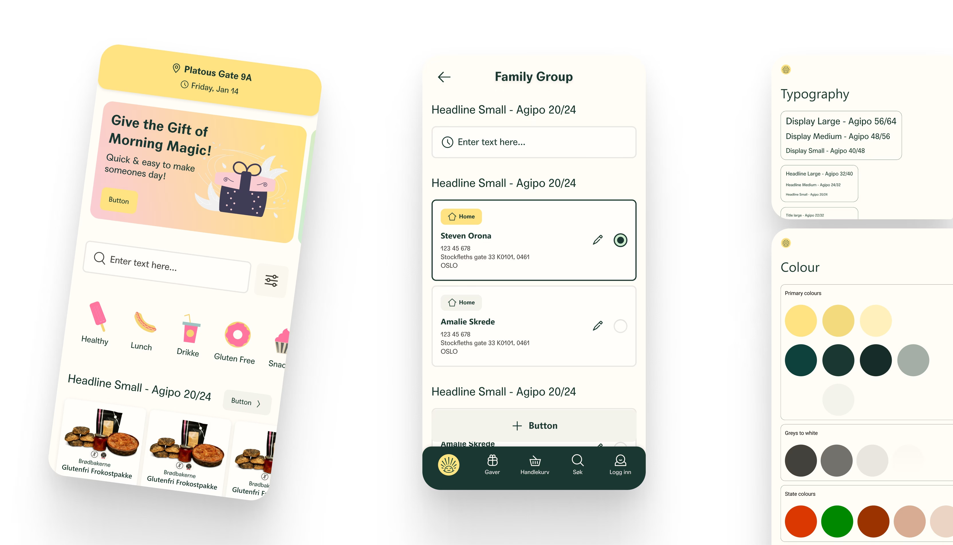
Family Group Management
I designed a Family Group feature that allows up to 4 members to coordinate orders. You can see who added items to the cart, all billed to one manager.
Subscription Engine
I built the UI for recurring orders. Users can set their Friday Breakfast once and forget it. I included clear controls for postponing or editing upcoming deliveries.
Gifting Experience
Sending a breakfast surprise became a core feature. I designed a flow where users can pick a contact, add a personal message, and send a gift levert på døren.
Sustainability Integration
I worked on the UI for Arbor verified metrics. Users can see exactly how much water or CO2 they saved by choosing specific bread products.
Process
User flow mapping
I mapped out every path from first login to receiving a gift. This made sure no user got lost in the process.
Component library
I built a robust set of reusable Figma components. This kept the design consistent and made it easy to scale the app later.
Prototyping
I built interactive prototypes to test the subscription and postpone logic. We found and fixed issues before development started.
Collaborative handoff
I worked directly with the engineering team to solve edge cases in the checkout flow. We stayed in sync using Slack and Figma to move fast.
Results
100+ screens designed and delivered for the full mobile app ecosystem
12 core flows mapped including Gifting, Subscriptions, and Family Management
97% accuracy achieved on developer handoff files
1st integration of sustainability metrics into a major Norwegian food app
Key takeaways
UI should be invisible
The best delivery app is the one you do not notice. If the food arrives on time with zero stress, the design worked.
Morning is emotional
We are selling a better start to the day. The colors and typography must feel warm and welcoming to the user.
Trust the system
A strong Figma library is the only way to manage a project this big. Consistent buttons and inputs save weeks of development time.